End Of The Semester Recap

Today…is my last post.

It’s not only the end of the semester, but I finally have to wrap this up so I can finish my visualization of this blog for my presentation on Wednesday.

I wanted to take the time to discuss what I’ve learned this semester and overview the work I have done.

This class was all about the “process.” As designers, we can’t forget about this first step or EVER skip over it. It’s the basis to a really thorough project. The process, whether it is random sketching, layout planning, reading, drawing, rough drafts, researching, googling, color matching, talking, critiquing…ANYTHING that will get you more prepared for the project at hand. Of course, sometimes, we will have to work through the process at a much quicker pace (we’ll get better with practice…hopefully), but the process should always be there. Plus, researching more about project will not only get you more informed about the product, but could even spark some new ideas or a new wave of creativity. This class spent a lot of time researching about Health Disparities…we spent all of our time dedicated to the process of researching, talking to experts, talking to each other, researching more, etc…and we all came up with all of these great projects that many of us are so dedicated to. This class really allowed us as designers to take our time with process work and discover more than what we saw at the surface.

It allowed us to discover that with process, comes inspiration.

*wink* the title to my blog *wink*

————-]

SO.

NEXT UP.

PRESENTING THIS DOCUMENT

AND

THE JUNIOR REVIEWWWWWW.

WOOOOOOOOOO…

Here’s the work that will be featured in the Junior Review (the amount of pieces are listed beside them)

WORK IN THE JUNIOR REVIEW

• Identification Documents= 3
• ECU Ads= 3
• Beer= 3D Models
• Beer Ads= 4
• Junior Review Poster= 1
• Health Disparities Project= 4
• Document= 1

Well.

Better get goin’.

Ya know, I’ve never had a blog before.

It’s not so bad. Haha

That’s all folks 🙂

HD Final Update

IT’S A BOY.


Well.

That’s referring to the poster I added to my series.

I took my classmates’ advice in adding a poster that had a reference to guys. They had suggested things to do with “meatheads” and working out…but I decided to stay on the same track as the others with calories and food references. And whaattt do many college boys like to do in their free time? Drink some ah-kee-hall.

GAAHH, if these people only knew how many calories beer has. It’s a bunch of empty and unnecessary calories.

Plus…its tastes like pee.

But that’s beside the point.

I also fixed my halftone pattern.

Not so checker-boardy anymore.

Overall, I am really proud of myself for the work I’ve done. I’ve worked hard, but mostly, I think it’s a strong concept and I think they’ve turned out pretty successful. There’s a few touch-ups I’d like to make, still, but I feel like I’m definitely coming to the finish line for this project.

Aaaaaand scene.

Stay Curious: Week In Design

Today, in class, we discussed the topic of “staying curious” or “staying creative” and ways to do so.

[Those go hand in hand too…because in order to stay creative, I believe you must stay curious.

Because if you’re not curious to create something new…you won’t have motivation to spark creativity.]

They listed little steps we can take as designers to do so: like sitting in a different seat everyday, etc.

The best part, however, were the games they introduced.

Little group drawing games that challenge your mind to just stay…creative.

I think that’s INCREDIBLY important for an artist and designer.

In order to CREATE…you must be CREATive.

And in order to be a good designer, your mind has to be constantly flowing…with newer ideas, newer layouts, themes, content, illustrations, etc.

This video is a great summary of simple ways to stay creative: http://vimeo.com/24302498

It’s also an easy and interesting watch.

It’s also very…

heh,

creative.

HD Project Critique

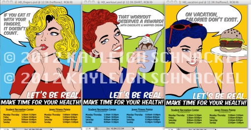
Below is an overview of the posters I created for the Health Disparities project: (watermarks provided, of course, for the wonderful word wide web)


Just as a quick recap, Lizzie and I wanted to develop posters that brought awareness to the “Funny Nutritional Lies We Tell Ourselves” and remind ECU students (our audience) that there are resources available on campus to teach them how to take control of their health instead of creating excuses for their actions. We both decided to create 3 posters each and, while sharing common themes, display our own style…Mine is very…errr…colorful…and “poppy.” I utilized both illustration and Photoshop to create my results.

Today we had a critique in class and many valuable points were brought to the table.

The most important was the fact that my characters are all girls.

I hadn’t really given this much notice before due to the fact that I was drawing inspiration from Lichtenstein’s pop art movement: WHICH did focus mainly on women.

It is a good note to point out that women aren’t the only subjects that are guilty of these nutritional excuses. Men have their flaws, also. It’s probably nooottttt a great thing to only associate women with this considering the many body issues and self conscious problems many face. It would be a good addition to point out that health issues know no “genders.” I am willing to take on this suggestion and make my series of 3 a series of 4: creating a poster that is directed towards men.

I was also told that the placement of the information on the bottom of the poster might be too monotonous: however, I’d still argue that it isn’t a bad quality for my series. I placed the information there so it would create a sense of continuity and flow. I think it makes the posters look very attractive sitting next to each other. I definitely had tried other placements, but realized that this was the most successful position for the hours, etc.

What I will be working on now will be the new poster addition. This will open up the audience to both females AND males: we did claim the ECU student body as our audience and last time I checked…boys go here too.

Or at least I think they’re boys.

A Graphic Designer’s Guide to Designing & Projecting a Professional Image

Carol Woodruff, from the Career Center.


It’s More Than Design

• Design Talent + Professionalism

• As a designer you will be a key partner or collaborator who can help the client, agency, department, etc. meet professional goals.

• “You’re not a monkey with a pencil”-you are a partner and they need to know that you GET IT.


Components of Professionalism

• Branding: designing the image you want to project

• Appearance

• Professional Savvy

• Communication Skills (Speaking by Phone, Person, Skype, Writing, E-mail, Web, & Networking)


Appearance

• Business Attire

• Hair, Nails, Teeth, Tattoos

• Hygiene

• Be perceived as a collaborator and a design-DON’T shock people and distract people with your appearance; Instead, attract them with your work and look as professional as possible when presenting it.


Professional Savvy

• Dress the part

• Think of yourself as a PARTNER

• Meet and greet with confidence

• Listen well (Hear beneath what they’re saying and get to the context of what they really want)

• Understand the client’s goal

• Take critical comments with grace


Communication Skills

• Approachable

• Listen Well

• Develop the ability to discuss your ideas and work in a compelling and understandable manner

• Don’t hang with the slang: Use proper English

• Use field terminology when appropriate

• Look people in the eye when you speak with them

• Unplug yourself

• Answering message

• Email Address

• Email as a formal mode of communication


The Ultimate Skill

• Networking (Face to face): making contacts with all types of people (your sphere and their sphere) to forward your professional career and also to be able to provide assistance to someone else

• Know how to give a correct, firm, and professional handshake (very important in face to face networking)

• Elevator speech: talk of your credentials and what you did during your school time


No Need To Wait

RESUME

• Targeted

• One page

• Error Free

• Attractive but not over-designed

INTERVIEWING

• Research Company

• Anticipate and prepare for questions

• Power Greeting

• What to Expect

• What to Wear

HD Project Progress…

After narrowing down our main concept for our Health Disparities project, Lizzie and I have made PROGRESS.

We both decided we are going to create 3 posters each, which share the same common theme, message, and approach.


Here are the three “Funny Lies We Tell Ourselves” I am portraying in my posters:

• “That workout deserves a reward…with whip cream…and chocolate.”

• “On vacation, calories don’t exist.”

• “If you eat it with your fingers…it doesn’t count.”

All 3 are being portrayed with a pop art approach: that is including the color choices and the portrayal of the girl characters, as well.

I’m pulling inspiration from Lichtenstein, however I am not copying the characters from his work; I’m manipulating them in a way that they are my own creation. They are utilized in a sense that helps communicate the chosen theme.


I spent my time today really focusing on the illustrations.

I am aiming to have them complete by tomorrow so I can scan them onto the computer, make them digital, and start adding color, as well as finalizing the layout with typography, etc.

For right now, the size of my posters are 11×17 and are vertical. Lizzie taking on the horizontal layout.


Oh! And we finally did narrow down which programs/locations we are advertising on our posters.

It’s a “Here’s the first step in taking control of your health” kind of tool addition.

The Student Rec Center (both Fall/Spring and Summer hour schedules)

The Wellness Program (hosted by the Rec Center…promotes and provides great tools that are health beneficial)

Art That Really Sticks With You…

Incredible Tape Art

This a really interesting set of pictures to look at: not only as a common viewer, but as a designer.

It’s a REALLY great reminder that magnificent design and creation can come from the most unexpected ideas or mediums.

Designers and artists should always remind themselves that just because it is strange and hasn’t been done before, it doesn’t mean it can’t be wonderfully creative and brilliant.

Always strive to think outside of the box, and always strive to be different.

If not, then you’re…just…the same as everyone else.

And what’s memorable about that?

National Geographic: Titanic Cover

Happy Birthday to meeeeee! I love this day 😉

Okay, back to design.

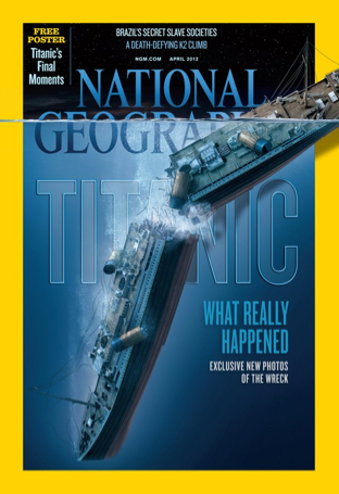
Today I wanted to publish a picture of National Geographic’s new April 2012 cover. It’s not only starring a topic that I’ve always found immensely interesting (the Titanic…WHICH is coming up on its 100th anniversary in April…probably an appropriate cover then), but it also, in my opinion, is very strongly designed. In terms of the graphic, I think it is extremely well placed and developed as it DEFINITELY tells a tragic story and depicts a very scary reality. I LOVE the breaking of the border; it really creates a dynamic composition and it doesn’t feel so stuffed in a traditional rectangle. This break of border is also repeated in the fill of the actual water, which stretches across the top as if the entire page were immersed in the ocean. In reference to the type at the top of the page…I think there is too much. However, I’m not sure how they could even avoid that because there is always mandatory information that HAS to be included AND you wouldn’t want text to really interrupt with the illustration depiction. I do really enjoy the type placed behind the Titanic; although they are partly covered, it is still evident of what it says…especially due to the popularity of the subject. One thing I’m not really fond of…is the yellow border. It’s thick…bright…and it kind of interrupts the overall attitude of the Titanic depiction. However, I guess that’s a usual addition for National Geographic Magazines. For me, it doesn’t sit well with the rest of the color scheme. Yes, it makes the cover stand out…buuutttt I think there are other colors that would have sit much better.

Overall, however, I think this is an effective design and I’m very impressed by the depiction and the handling of the composition.

HD Project Process

Lizzie and I have been brainstorming more about our health disparities project.

We’ve narrowed our ideas down to one common theme:

“The Funny Nutritional Lies We Tell Ourselves”

It’s a way to not only provide a laugh, but give a reality smack to people and let them confront these weird excuses that they THINK hold any amount of truth.

Although health disparities aren’t funny, it’s important to look at our audience: College students. We are drawn to light-hearted things and, in a sense, shut down when things get too serious. In a way, we’re the ones that think we’re invincible…telling people, “YOU’RE GONNA DIE IF YOU EAT THAT” might just cause some people to shrug it off or ignore it. It’s something I’m guilty of. Besides…they’re posters. If I saw a poster that said I wasn’t being healthy or making the right choices, I’d say, “THAT POSTER DON’T KNOW ME!!” Maybe with a little better grammar, but definitely around that concept.

So here’s our plan:

Examine and display those nutritional lies we continuously tell ourselves.

Partner that with some REAL facts (short and too the point).

And then accompany it all with another common theme: MAKE TIME FOR YOUR HEALTH, while providing the hours to the Student REC center, Nutritional center, etc. We want to make sure we can accompany our posters with ways in which people can take control of their lives and beat those excuses.

The style? We’re thinking…pop art. It’s colorful, it’s noticeable, and it won’t get lost within the MILLIONS of posters hung around campus…or at least we hope not.

Okay.

Common excuses.

Well…funny or naiive common excuses.

*”If I put a lot of lettuce and tomatoes on my triple cheeseburger, they’ll essentially cancel out the calories.”

“Dark chocolate is healthfood.”

“If you eat it with your fingers, it doesn’t count.”

“If a cookie is broken…all the calories leak out.”

“Eating while standing burns off calories faster.”

“What do you MEAN there’s no such thing as a Cook Out diet?”

*”I’m on vacay…I left all the calories at home.”

“My daydreams of being skinny always get interrupted by the sound of my chewing” -ee

*”A great workout deserves a great reward…with chocolate…and whip cream.”

—————–}

Ok, I’ll continue my search for some more later.

We’ve definitely gotten to a great foundation for the project.

Next up: artifact for Monday’s class!

Beginner’s Guide to Pairing Fonts

{}

Typography is important.

And should remain important for the goodness of all graphic design (in which type is utilized, of course).

Take note of these…err…notes.

—&—

And DEFINITELY these mentioned by Craig:

• Don’t combine two sans serif or two serif families together in a single layout. Helvetica and Univers will clash if combined. So will Centaur and Bodoni.

• A primary rule of thumb is that opposites attract. Combining a well-designed sans serif with a serif face will nearly always create a good and compatible pair.

• And then, avoid excess. Two over-the-top typefaces will look like a collision. A more decorative display face should be paired with a quiet, neutral and readable text face.